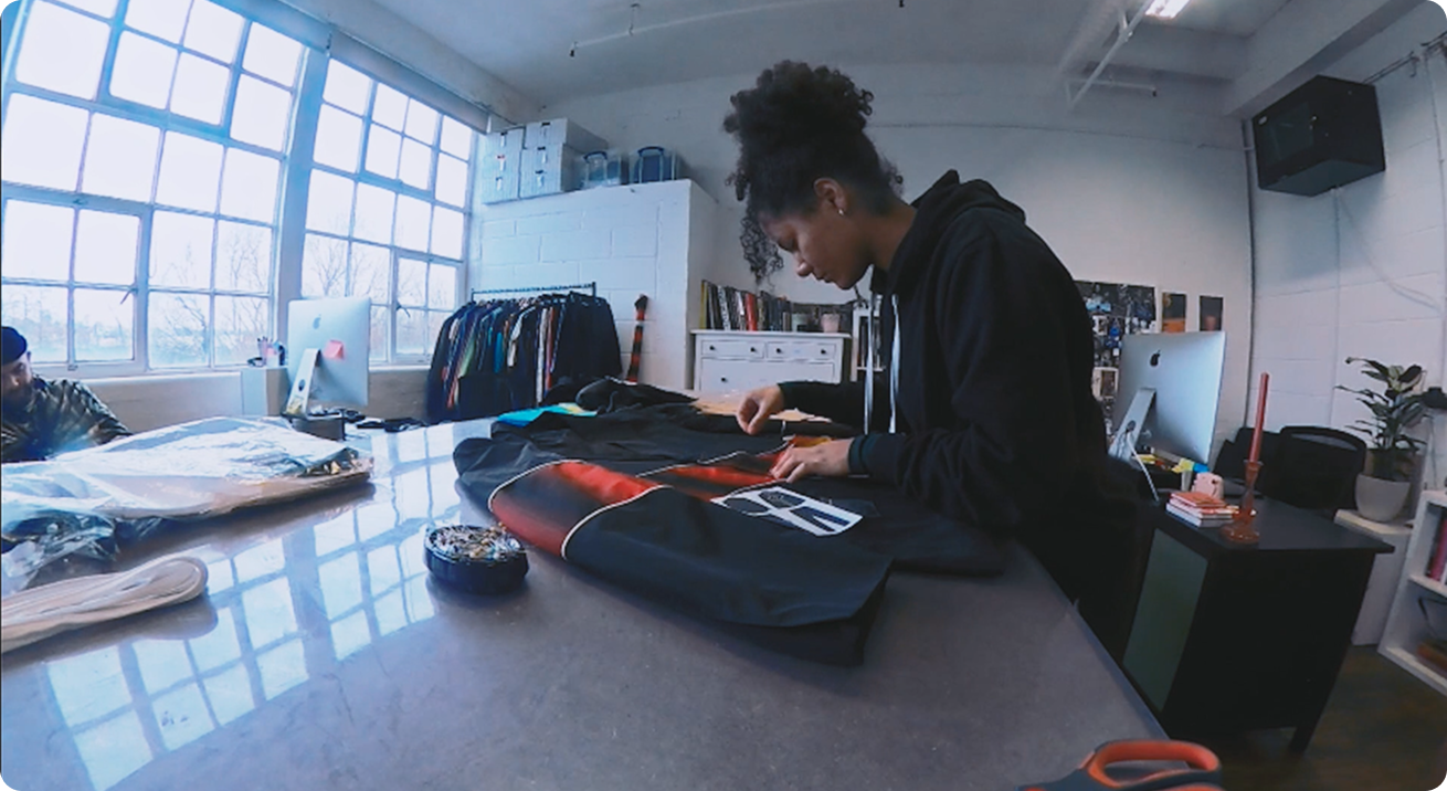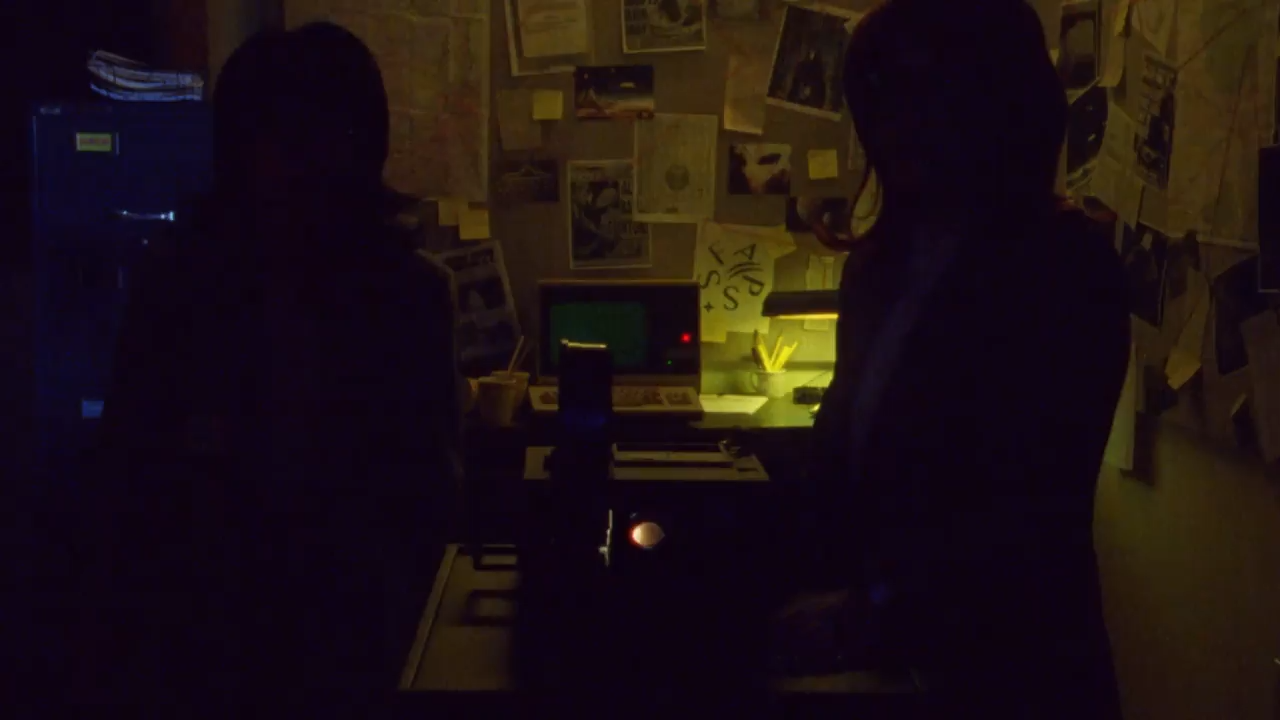

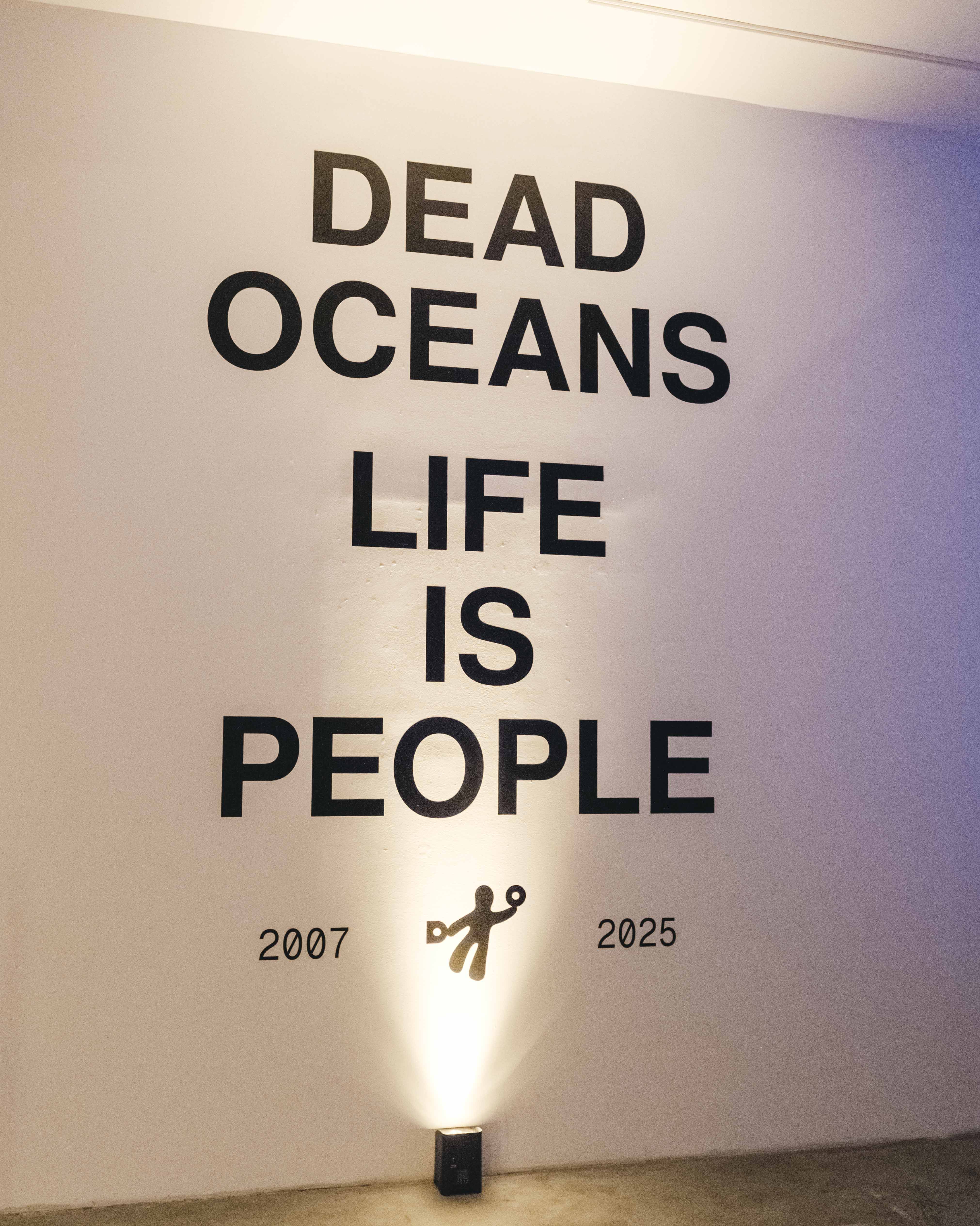
For this indie record label, a logo is more than a few pixels on a screen. It defines an entire identity.

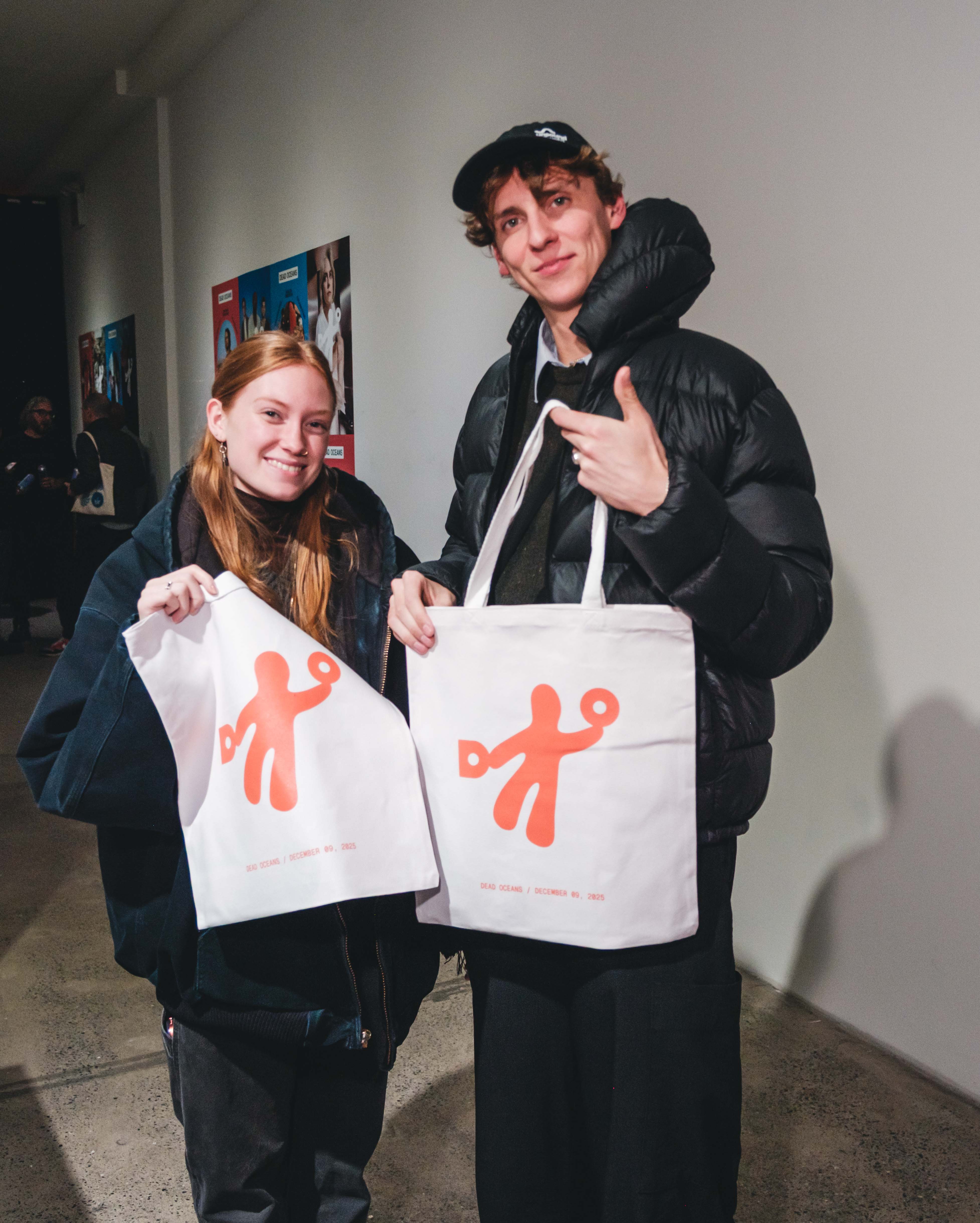
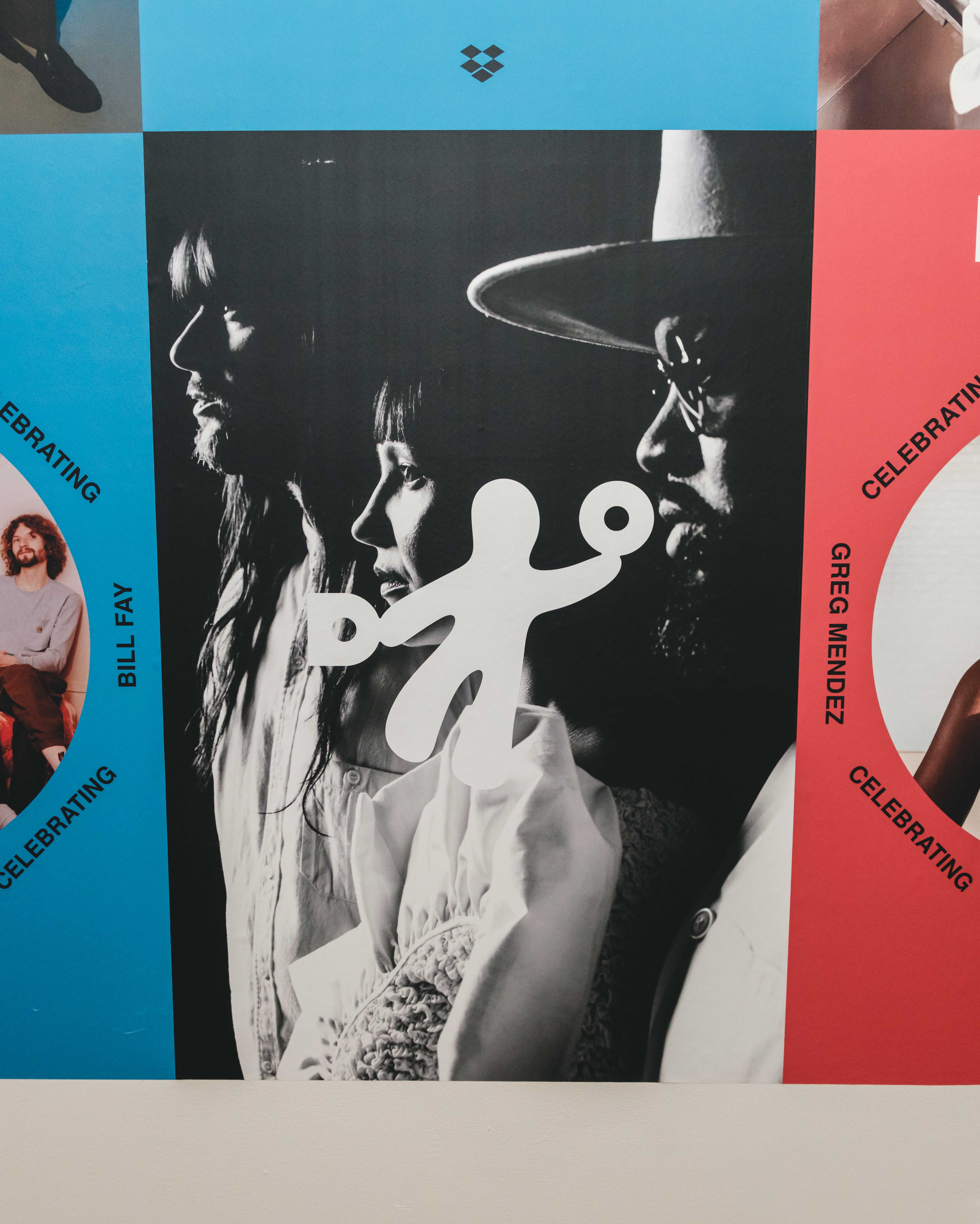
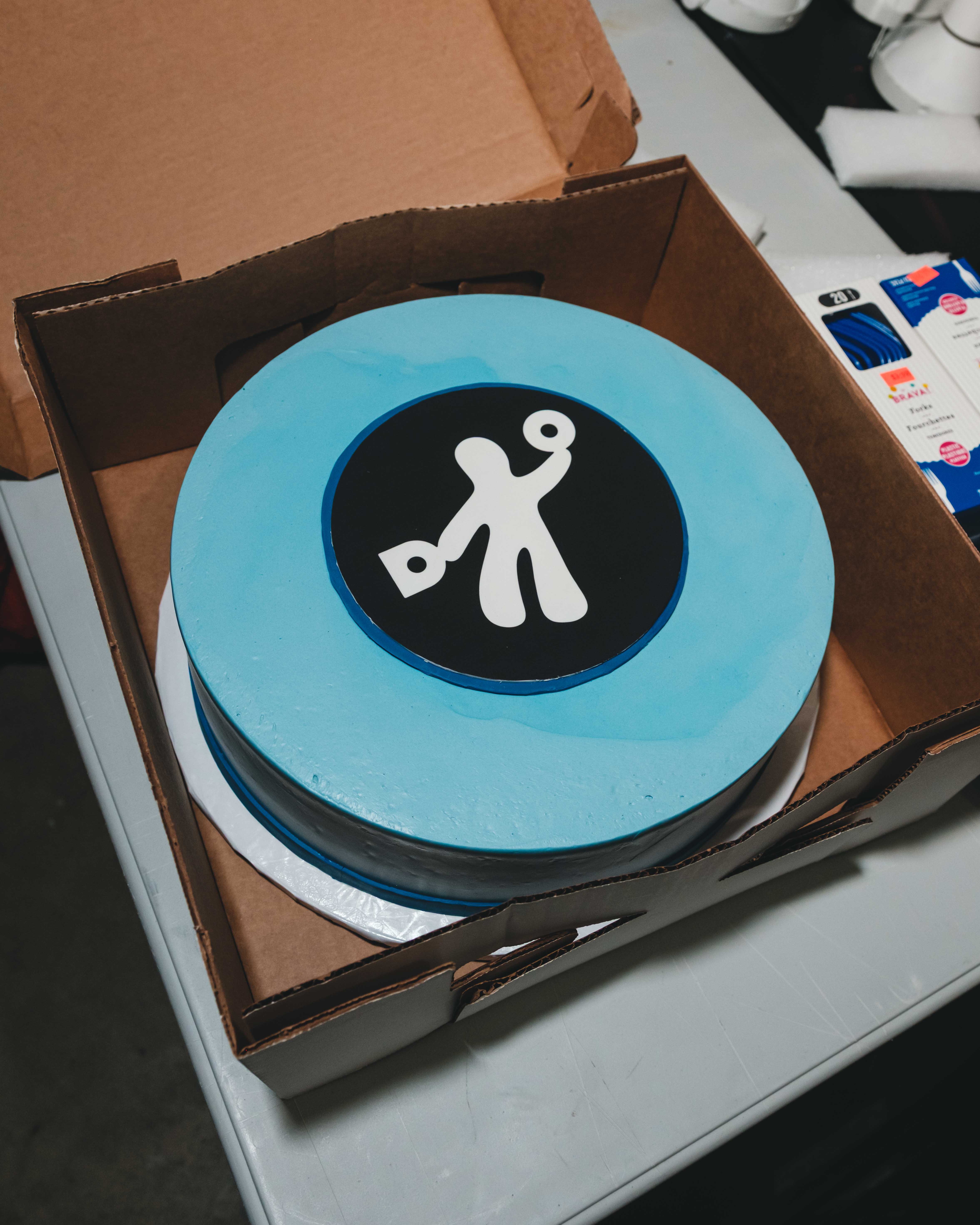
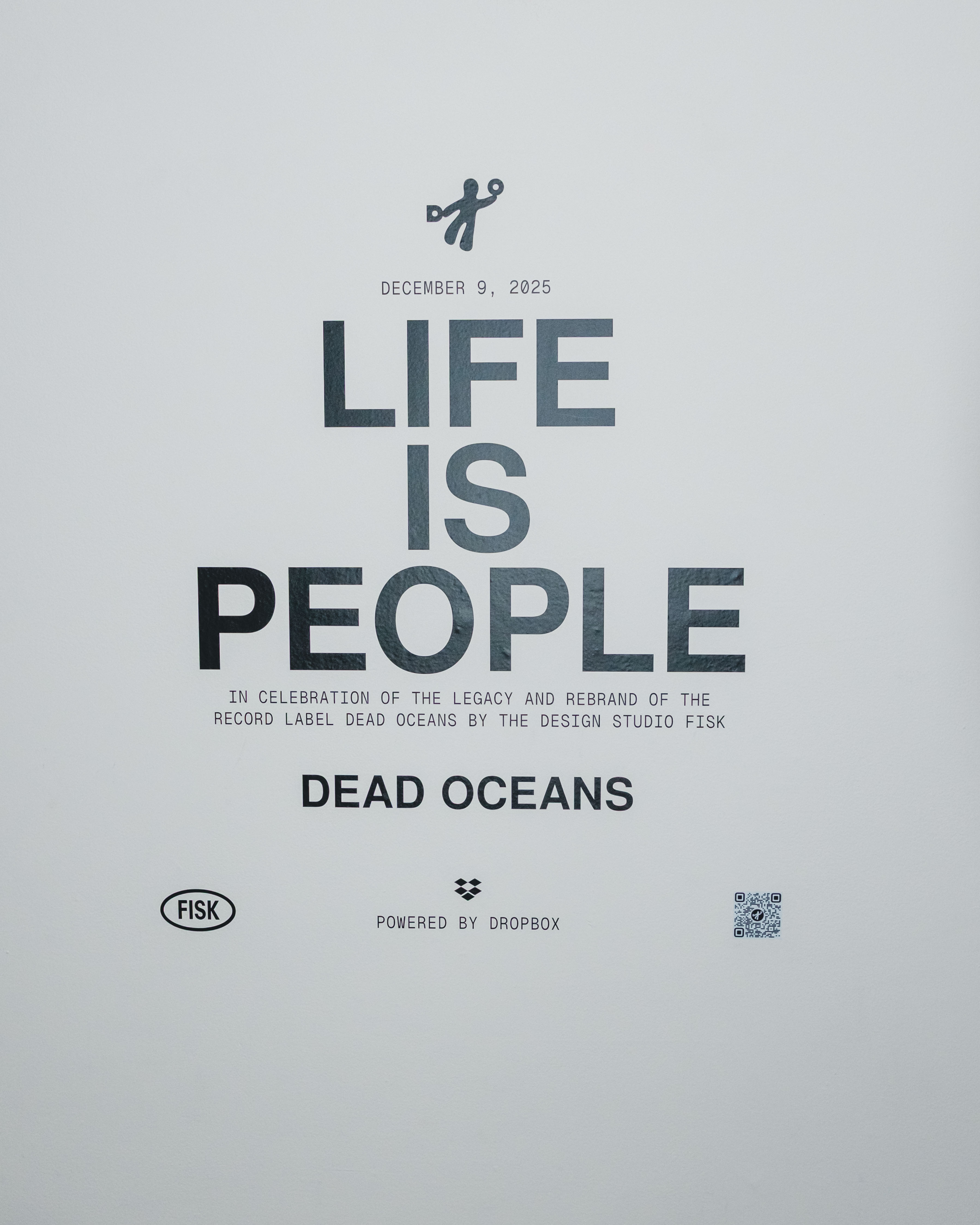
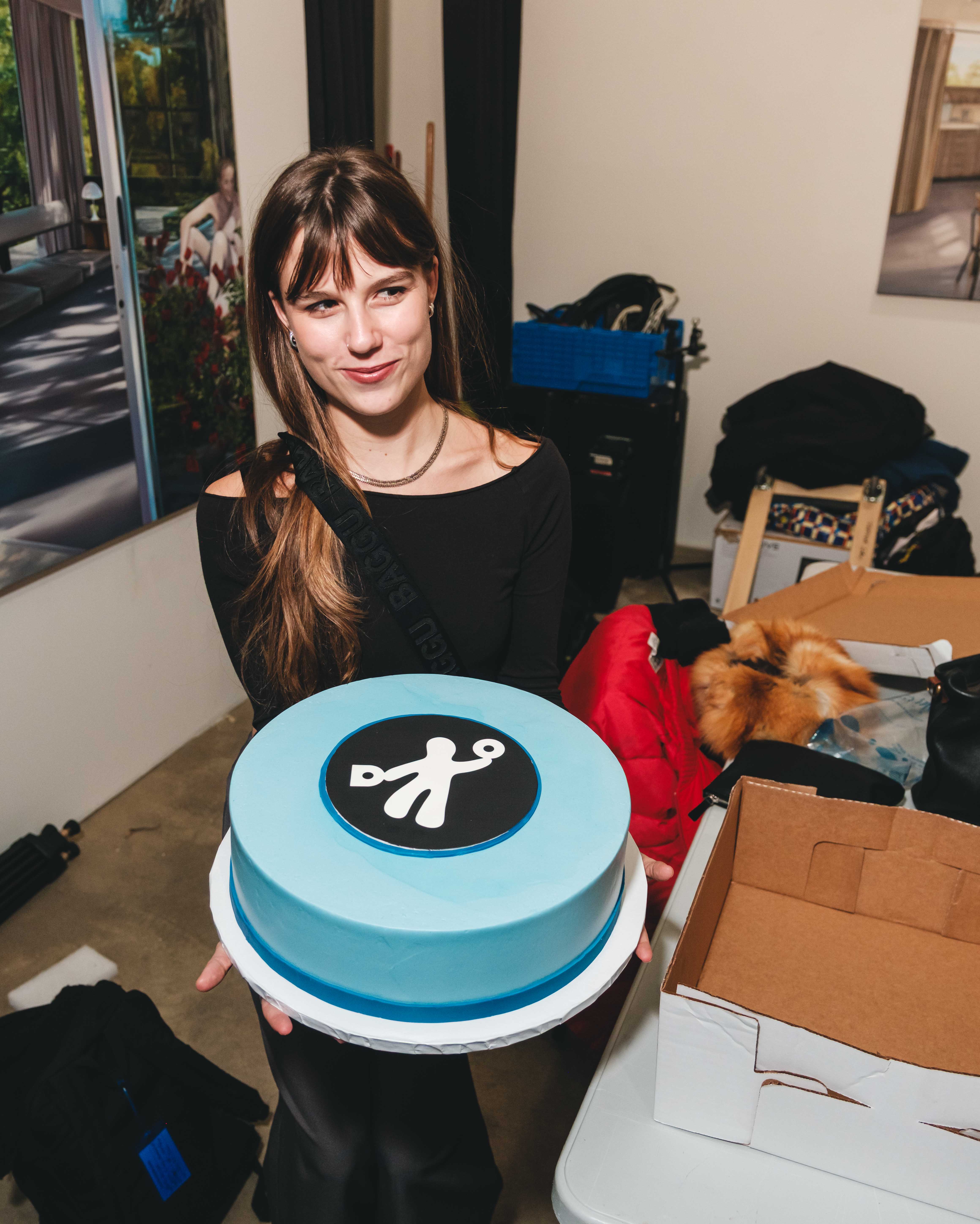
Record label Dead Oceans, home to artists like Mitski, Japanese Breakfast, and Phoebe Bridges, knew it was time for a rebrand. After 18 years, the logo that once represented them no longer fit. Inspired by a shower curtain, it had been built for a much smaller label. They turned to design agency FISK for a bold reimagining.
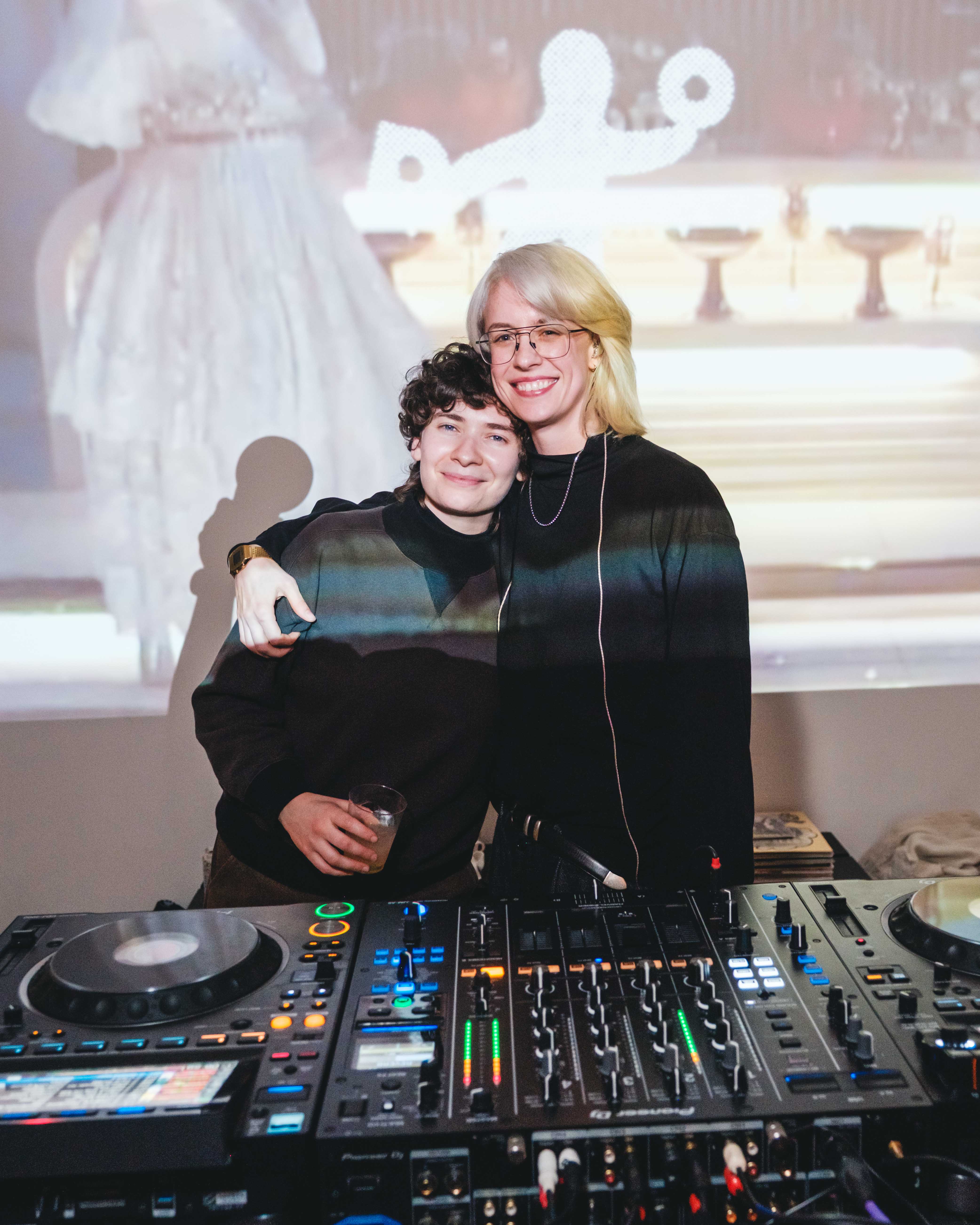
“Record labels are built on their heritage, but the trick is finding success by looking forward.” —Miles Johnson, Secretly Group
00:36
The visual evolution
Dead Oceans
play video
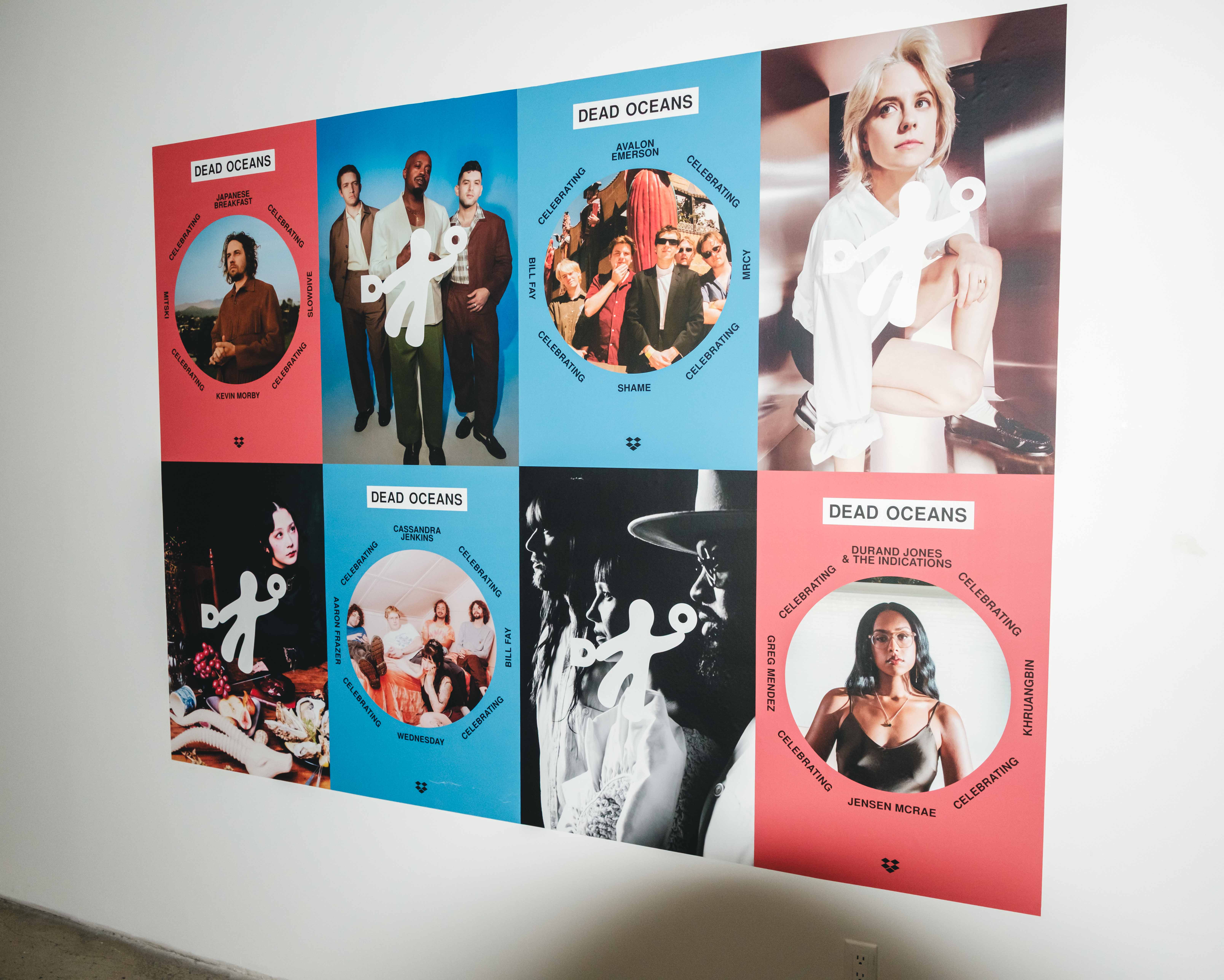
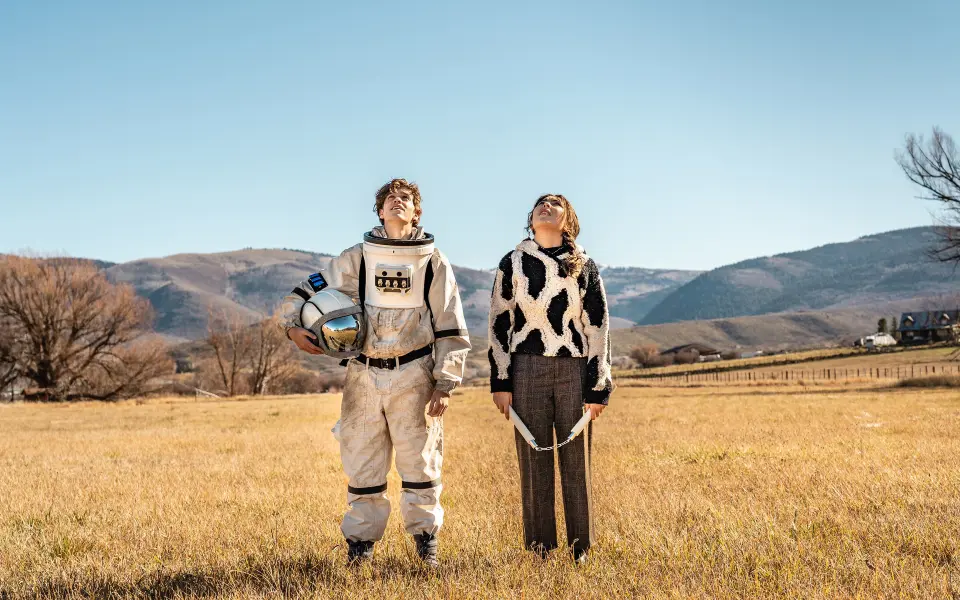
FISK designed new wordmarks, merch patterns, and roster-defining graphics that fit who Dead Oceans had become and where they were going.
Throughout the project, teams working between Portland, OR, New York, and London used Dropbox to fuel cross-timezone handoffs between label and agency, keeping files and feedback creatively aligned and focused throughout the process.
Event DSCF9692.jpg
Event DSCF9490.jpg
Event DSCF9972.jpg

Event DSCF9475.jpg
Event DSCF9474.jpg

D025_Identity_091625.png
Drag artifacts to rearrange
Continue exploring




view story